> For the complete documentation index, see [llms.txt](https://guide.data.gov.sg/llms.txt). Markdown versions of documentation pages are available by appending `.md` to page URLs; this page is available as [Markdown](https://guide.data.gov.sg/user-guide/for-data-owners/how-to-edit-a-chart.md).
# How to edit a chart
{% hint style="info" %}
This page covers changing a chart you have already saved. If you have not made one yet, start with [How to create a chart](/user-guide/for-data-owners/how-to-create-a-chart.md).
{% endhint %}
## Part 1: Open a chart for editing
1. In the admin panel, open your dataset and scroll to the Charts section.
2. If the dataset has several charts, click the thumbnail of the one you want to edit.
3. Click the edit icon above the chart. The editor opens on the right.
4. Change your settings, watching the preview, then click `Update` to save.
{% hint style="warning" %}
`Cancel` or navigating away from the editor without saving discard everything you changed.
{% endhint %}
{% hint style="info" %}
Nothing is saved until you click `Update`. Closing the editor or navigating away loses your changes.
{% endhint %}
## Part 2: Order and hide values
Use this when your chart shows categories you do not want, or shows them in an unhelpful order.
The **Sort** control appears under the X-axis when that column holds text, and under **Group by** whenever a Group by column is selected.
**To reorder values,** open the Sort dropdown and pick an order:
* `A → Z` and `Z → A` for text
* `Low → High` and `High → Low` for numbers and dates
* `Manual order` when the sequence matters and is not alphabetical
In Manual order, drag handles appear beside each value.
**To hide values,** click the eye icon beside any value in the Items list. `Hide all` and `Show all` toggle everything at once.
Hidden values disappear from the chart and its tooltips. Your published data is untouched – hiding is a display setting on this chart only, so people downloading the dataset or calling the API still get every row.
## Part 3: Set a range
Use this when you want to show a slice of the data – the last five years of a series that goes back to 1960, for example.
The **Range** control appears under the X-axis when that column holds numbers or dates, and always under the Y-axis.
* Fill in **Min**, **Max**, or just one of them. Left empty, the chart scales itself to the data.
* `Reset to auto` clears both fields.
Date ranges accept the same six formats the platform uses, and are not case sensitive, so `2020-q1` works as well as `2020-Q1`:
| Interval | Format | Example |
| ----------- | ------------ | ---------- |
| Annual | `YYYY` | 2015 |
| Monthly | `YYYY-MM` | 2015-01 |
| Daily | `YYYY-MM-DD` | 2015-01-01 |
| Weekly | `YYYY-WNN` | 2015-W01 |
| Quarterly | `YYYY-QN` | 2015-Q1 |
| Half-yearly | `YYYY-HN` | 2015-H1 |
## Part 4: Change labels and titles
The **Label** field under each axis controls what readers see, and is auto-filled based on the column's Display Name.
* Edit it freely – the label does not change the original data.
* Clear it to remove the axis label from the chart entirely.
* The **Title** at the top of the editor is the chart's heading on the public page.
With a Group by column, each series is named after its value. With several Y-axis columns, each series is named after its column. With a single Y-axis column and no grouping, the Y-axis label names the series.
{% hint style="info" %}
Adding a second Y-axis column clears the Y-axis label.
{% endhint %}
## Part 5: Chart more than one measure
Under Y-axis, `Add field` adds another column to the same chart.
* Each field has its own **Measure**, so you can sum one column and average another.
* Click `×` beside a field to remove it.
## **Part 6: Display settings**
These settings change how the chart looks, never what it plots. They sit under **Others**, below the axis sections.
### **Select colours**
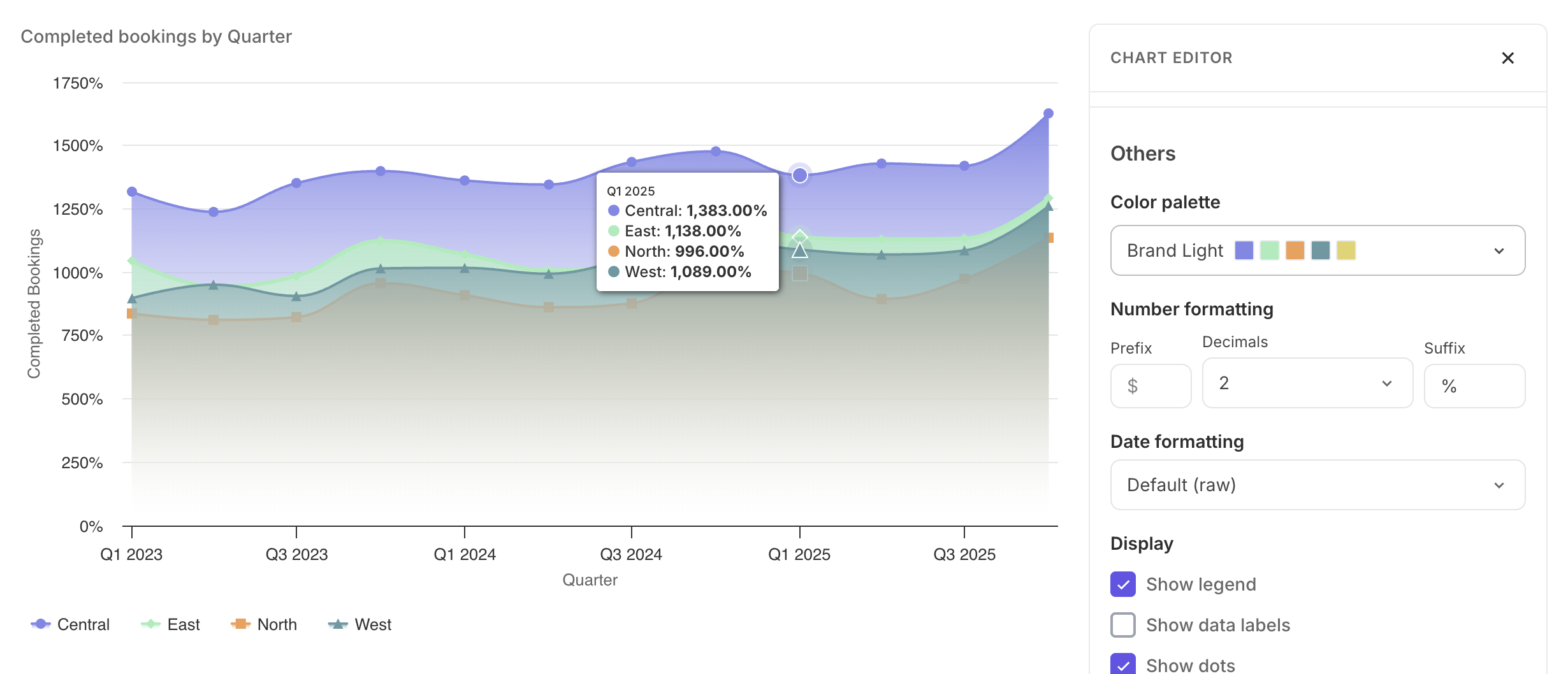
A palette dropdown restyles every series at once. Each row shows the palette name and its colours.
| **Palette** | **Colours** | **Use for** |
| ------------- | ----------- | -------------------------------------------------------------------------------- |
| Default | 11 | The platform's standard palette – leave as-is unless you have a reason to change |
| Brand Light | 8 | Softer tones |
| High Contrast | 10 | Charts that need to stay legible for readers with low vision or colour blindness |
| Sand Signika | 9 | Warmer tones |
When your chart has a single series, a row of swatches appears below the palette so you can pick one specific colour from it. Click the same swatch again to go back to the palette's first colour. The swatches disappear if you add a second Y-axis column or a Group by column, since the palette then has several series to colour.
Series colours stay put when you hide or reorder values, so a category keeps the same colour across every version of the chart you publish. Changing palette clears a single-colour choice.
### **Show or hide the legend**
`Show legend` is on by default and names each series below the chart.
### **Show data labels**
`Show data labels` is off by default. Turning it on prints the value on each bar or point.
### **Grid lines**
Two independent checkboxes: `Horizontal grid lines` is on, `Vertical grid lines` is off.
Horizontal lines help readers trace a bar or point across to the Y-axis, which is why they are on by default. Vertical lines are worth adding when the X-axis has few, widely spaced categories.
### **Line and area charts: dots and smooth lines**
Two checkboxes appear only for Line and Area charts.
* `Show dots` is on by default and marks each data point.
* `Smooth line` is off by default and curves the line through the points instead of joining them with straight segments.
### **Area charts: gradient**
`Gradient` appears for Area charts only and is off by default. It fades the fill from the series colour down to transparent.
## **Part 7: Formatting**
Formatting changes how values are written on the chart. Your data is untouched, so anyone downloading the dataset still gets the raw values.
### **Number formatting**
Applies to the Y-axis, since that is where measured quantities sit.
**Decimal places** – Default leaves the chart to choose. This applies to tooltips and data labels only. Pick a number between 0 to 4 when precision matters.
**Prefix** and **Suffix** – add a unit around the value: e.g. `$` before it and/or `%` after it. Both apply to tooltips, data labels and axis ticks.
If a column is already typed as a percentage, `%` is applied for you. Entering your own suffix overrides it.
### **Date formatting**
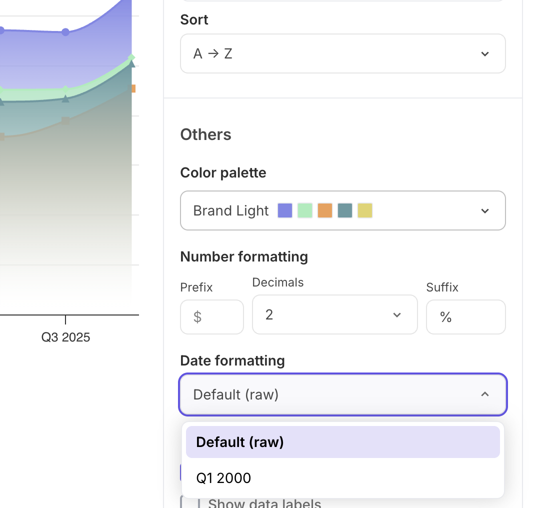
When your X-axis column holds dates, a dropdown offers readable versions of the format the editor detected in your data.
| **Column format** | **Reads as** |
| ----------------- | ---------------------------- |
| `YYYY-MM` | Jan 2000 |
| `YYYY-MM-DD` | 01 Jan 2000, or Jan 01, 2000 |
| `YYYY-QN` | Q1 2000 |
| `YYYY-HN` | H1 2000 |
| `YYYY-WNN` | Week 1, 2000 |
Default shows the raw values as they appear in your file. The format you pick applies to both the axis and the tooltips, so the two never disagree.
## Part 8: Manage your charts
**Download a chart as an image.** The download icon above the chart saves it as an image, for slides or documents.
**Delete a chart.** The delete icon removes it, after a confirmation. This cannot be undone, and the chart disappears from the public page as soon as the dataset is next published.
**Re-upload your CSV.** When you upload new data with the same column names, your charts are kept and re-render against the fresh figures. Extra columns are fine. If a column a chart depends on is missing from the new file, that chart breaks – its thumbnail is marked, it stops appearing on the public page, and you will need to edit it to point at a column that exists, or delete it. Other charts on the dataset are unaffected.
For further queries feel free to reach out to us: [Contact the Data.gov.sg team](https://form.gov.sg/6449e5c3664c1b001249acf1)